User interface (UI) design is important because it prioritizes a user’s experience. A good user interface is functional, reliable, and easily understood.
Since good UI design minimizes user effort, it helps users complete your goals and follow along the user journey, making your app or site more effective, useful, and profitable.
Key takeaways:
User interface design is the space where interactions between humans and machines occur
Though often confused with UX design, UI design focuses more on the visual feel of a user experience
UI design can be the difference between a business’ success and failure
There are three types of user interfaces: graphical user interfaces, voice-controlled interfaces, and gesture-based interfaces
Designers need to seek a lot of internal and external feedback
There are many UI tools to help you create a clean design
What is user interface (UI) design?
User interface (UI) design is the process of crafting the visual and interactive elements of a digital product, like layouts, buttons, menus, and typography. It focuses on creating interfaces that are visually appealing, intuitive, and functional, ensuring users can interact seamlessly with the product. UI design can include graphical user interfaces, voice-controlled systems, and other interactive platforms.
Designers aim to create interfaces that are easy and pleasurable to use. UI design refers to graphical user interfaces and other forms—like user-engaged interfaces.
The UI is the space where interactions between humans and machines occur.
UI is an integral aspect of user experience (UX) that consists of two major parts:
Visual design—which translates the look and feel of a product
Interaction design—which is the functional and logical organization of elements
The goal of user interface design is to create products, apps, and services that are easy and enjoyable for users to interact with, while minimizing user frustration and abandonment.
The difference between UI and UX design
Often confused with UX design, UI design is more concerned with the surface and overall feel of a design.

What UX design is and isn't
UX is the end-to-end experience a user has when they interact with a product. Unlike UI, UX is not limited to digital, but also includes physical products.
UX design covers the entire spectrum of the user experience—from qualitative and quantitative user research to user flows to wireframes—and includes how the user would engage with it.
UX design is the process of understanding user needs and goals, then making a usable and enjoyable design that helps them meet these needs. They solve product problems to boost business and make users' lives easier.
What UI design is and isn't
A UI is a space where users see and perceive information.
UI design focuses on the visual design of interactive elements. As an overall practice, it exclusively focuses on digital products—interactive elements like drop-downs, forms, animations, visual styling, and more.
A UI designer uses the frameworks and rough designs UX pros create and turns into high-fidelity and final designs before handing them off to a development team.
UI design builds a fundamental part of the user experience, including high-fidelity prototypes and final designs
As Ken Norton, a partner at Google Ventures, put it: “The user interface is tables, chairs, plates, glasses and cutlery. UX is the quality of food served, service, features of parking, lighting and music.”
The importance of UI design
We interact with user interfaces every day, whether it’s using an appliance, logging in to a work platform, or buying on an ecommerce shop.
Successful UI design can make the difference between an excellent user experience and a poor one. It can also determine user frustration and avoid failed conversions. It's critical to a business’s success.
It’s important to understand and apply UI design principles as well as the guidelines of website design. These principles (or some of them) are as follows:
Keep it simple and straight to the point.
Function and navigation are critical.
Stay consistent and true to the design.
Work with a user-centric approach.
Using the right tools can help you create the best interface for your product. There are a few different UI design formats that may help you understand the interface a bit.
User Interface design formats
User interfaces are the access points where users interact with designs. They typically come in three formats:
Graphical user interfaces (GUIs): When users interact with the visuals on digital control panels—for example, your computer’s desktop.
Voice-controlled user interfaces (VUIs): When users interact vocally. Most smart platforms like Siri or Alexa are voice-controlled interfaces.
Gesture-based user interfaces (GBUIs): When users engage with 3D platforms with active motions, like virtual reality (VR) video games.
Graphical user interfaces are the most popular and require the most effort. With GUIs, you need an engaging site or app from end to end.
User interface design considerations
Your goal is to find out what your users or visitors want in your design. Here are some interface design considerations as you set out.
1. Usability
Typical website and app users care about one thing: They want to accomplish a goal. Most of what they care about is usability and functionality. Does it work, and they accomplish their goal?
Most users won’t focus on aesthetics if they can’t accomplish what they came to get done.Your design should complement your UX, first and foremost helping users complete their tasks.
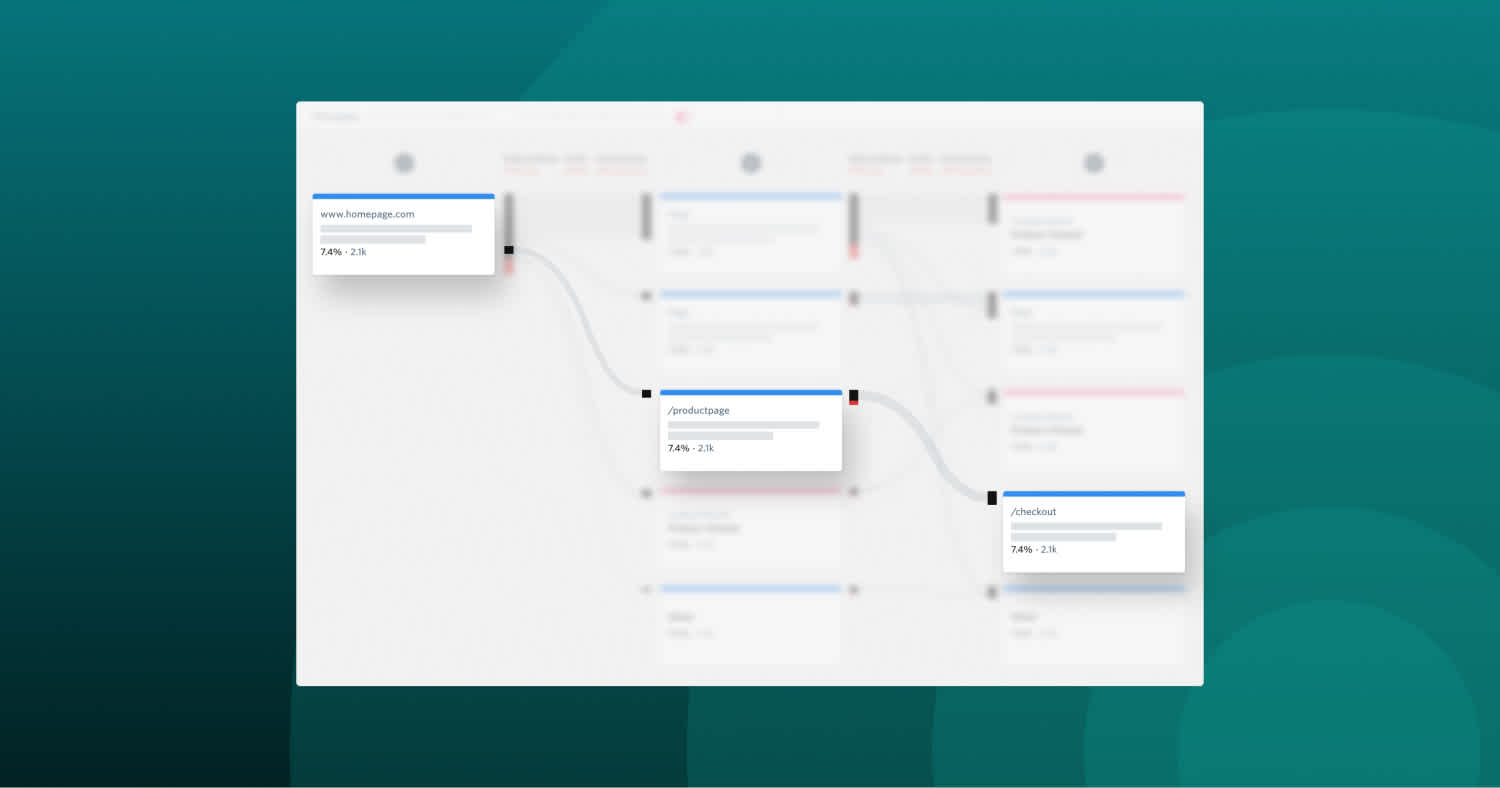
It’s smart to try to understand your users’ task flows (read more about customer journey maps) and why they’re engaging with you in the first place. This’ll help you make an intuitive, smooth user interface.
2. Enjoyability
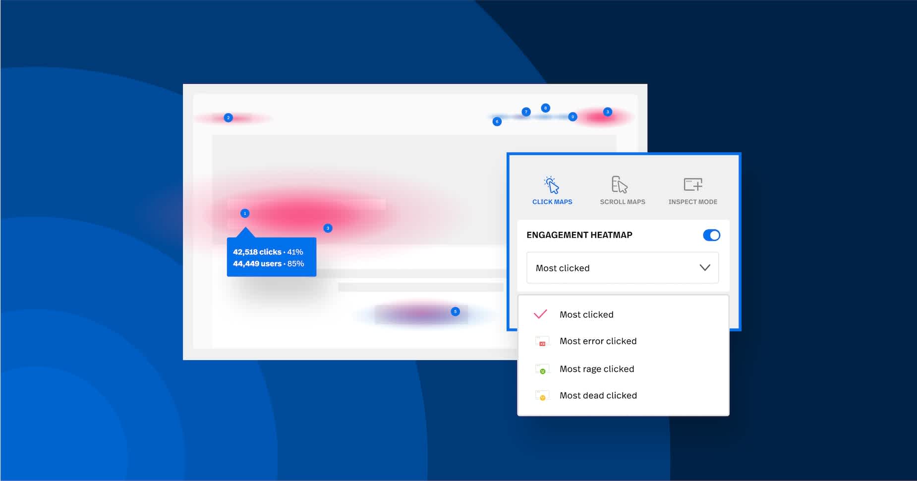
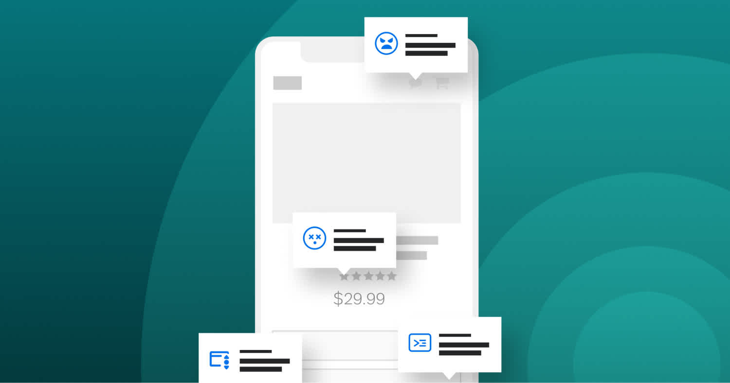
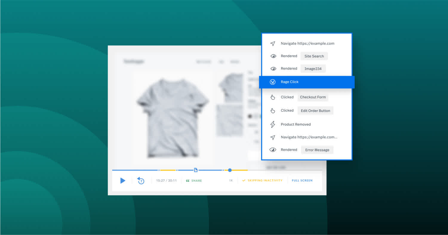
User interface designs should also be enjoyable—or at least frustration-free. If your design frustrates users, resulting in frustration signals like rage clicks, dead clicks, or thrashed cursors, that means people aren’t enjoying your experience. Happy users mean a happy business, and the best designs predict users’ needs and allow them to engage with a more personalized and immersive experience.
For example, many apps incorporate gamification elements to increase engagement and interactivity.
3. Authenticity
Because design can be subjective, it’s important to create unique UI that are both helpful and consistent with the rest of the brand. Essentially, if the logo on your website or app didn’t appear, does it feel uniquely yours? Would users be able to tell that it’s your company, or would it be indistinguishable from the competition?
UI should communicate brand values and reinforce users’ trust. That means that the UI design should be authentic to a brand’s identity, mission, and values.
Users have positive associations with brands whose experiences evoke good feelings – going past just seamless experiences to those that delight.
4. Consistency
Maintaining a consistent UI design is key—not only does it reflect on your brand, but it also shows the user what they can expect from you.
Being consistent across your website or app showcases intentional continuity. Imagine if you went to a website and on every landing page there were different colors, different fonts, and different style imagery. You would think it was a mistake.
5. Accessibility
It’s important to consider all types of users when planning your UI design. Accessibility plays a factor, and there are a few key ways to keep it in mind as you design:
Use color and contrast to create distinction among elements and pages.
Use and include various visual hierarchy elements and pages.
Use your interactive UI elements to drive meaning and connection.
Conduct user testing consistently with accessible elements.
User Interface elements
Users have become familiar with certain interface elements and how they behave, so being consistent and predictable in your choices is key. Staying consistent will increase task completion, efficiency, and user satisfaction.
Key user interface elements
Navigational components
Navigation components help users move around a product or website. (E.g., breadcrumbs, sliders, search fields, pagination, tags, or icons.)

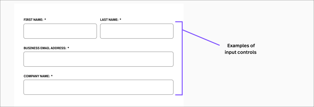
Input controls
Input controls let users input information into a system. (E.g., buttons, text fields, checkboxes, radio buttons, dropdown lists, or, toggles.)
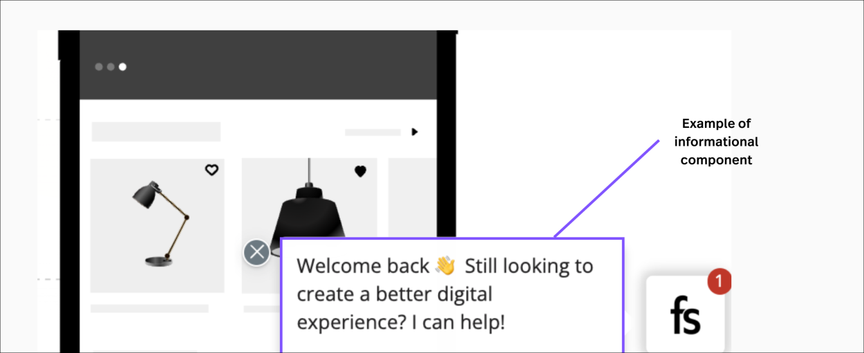
Informational components
Information components share information with users. (E.g., tooltips, icons, progress bars, notifications, message boxes, or modal windows.)
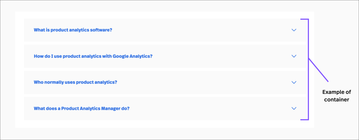
Containers
Containers hold related content together. (E.g., accordions, carousels, or scrollbars.)
Consider multiple elements as well. For example, sometimes elements that can save you space on your website or app actually put more of a burden on the user by forcing them to guess what is within the dropdown might be.
Methods of UI design collection
There are a few methods of design collection that may help you as you set out to create the best user interface out there.
Designers use methods of user-centric design to learn about their target audience, ensuring the visual language they introduce makes sense. A few feedback collection methods include:
User interviews or customer feedback
Direct observations
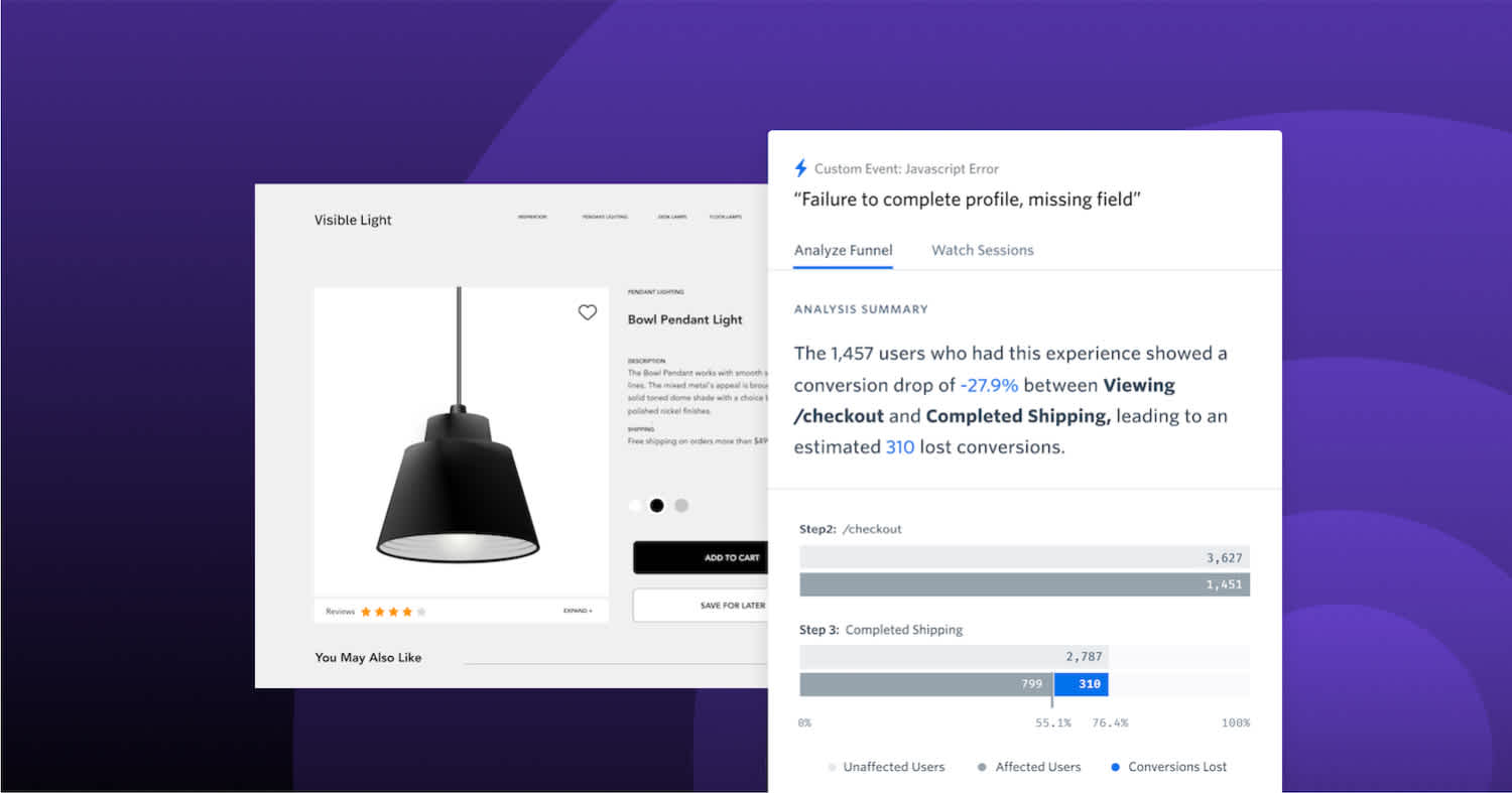
Data analytics or digital intelligence
Internal testing
A/B testing can be particularly useful in this phase, allowing designers to compare different interface variations and measure their impact on key metrics like user engagement and conversion rates.
Tools like Optimizely and behavioral data platforms like Fullstory help you gather information then test out new ideas. For example, you can use Fullstory's heatmap software or Session Replay platform to see what users are doing on any given page, helping you understand where they might be confused.
Collecting both qualitative and quantitative data is imperative to understand your design and how to improve it.
Data 101: What is qualitative data?
Learn everything you need to know about qualitative data, how to collect it, how to analyze it, and how to take action.
UI design tips for a website
Designing UI components for a website is a very open-ended and often subjective task. A few tips to help understand what good UI might look like for your website:
Utilize your user’s pain points
Create customer journey maps to better empathize with what your users are trying to do. Focus your design on how to answer their struggles. A simple example: if you sell laptops, and it’s back-to-school time, put design emphasis on pain points for students, teachers, and parents. Fullstory is a great way of seeing how different users interact with websites and mobile apps.
Keep an interface inventory
As you start designing user interfaces, cataloging them can get complex.Index your designs and make notes of what is working and what is not—for updates and edits in the future.
Identify design patterns
Establishing contextual patterns in your layouts will make your UI more intuitive. Once a user understands how to operate your design, they should be able to take that skill to other parts of the site.
Create a drafted prototype
Mock it up! Design in drafts, get approval, get feedback and then launch.
Best practices for designing an interface
When it comes to best practices for designing an interface dedicated to user experience design, everything points back to what users need. This includes understanding their struggles, goals, preferences, and tendencies. You can find out what these are by following the customer journey map.
Once you know more about your user, consider the following when designing your interface:
Keep the user interface simple. Some of the best user interfaces are incredibly straightforward. They avoid complex elements and are clear in the copy they use and in messaging. (Think of Craigslist—incredibly simple, but very useful.)
Create design patterns. It’s also important to create contextual patterns in your layouts to help with functionality. That is, to make your UI more intuitive. Once a user understands how to operate your design, they should be able to take that skill to other parts of the site.
Use common UI elements. By using common elements (like checkboxes) in your UI, users feel more comfortable and are able to solve their problems more efficiently.
Use color and texture strategically. To draw the user’s attention to (or from) certain elements, you can use color, light, contrast, and texture in various elements or pages. Consider different variants of real-life shading for calls to action.
Consider spatial relationships in your layout. Remember the “white” space between elements on the page and structure it based on priority. Strategic placement of items helps draw attention to the most important pieces of information and can help with readability or users that skim.
Create hierarchy and clarity with typography. Carefully consider how you use any typeface. Different fonts, sizes and arrangements of the text helps increase scan-ability, legibility, and readability.
By taking into account the goals users have when they visit your site, you can create designs that increase the attention of the user. This becomes particularly important when it comes to form design where you might have an opportunity to personalize.
Recommended UI design tools
As with anything, you’ll need your tools for success. Here are some recommended UI design tools to choose from:
Sketch
A digital design platform for collaboration.
Wondershare Mockitt
A free online design, collaboration and prototyping tool to enhance your user experience.

Invision Studio
A powerful screen design tool that uses a whiteboard for collaboration.
Figma
A collaborative interface design tool for prototyping and launching engaging websites and apps.
Miro
A free open-source collaboration platform to sketch up your next interface.
Avoid critical UI mistakes using Fullstory
Fullstory’s behavioral data platform provides qualitative and quantitative insights on user data, offering teams a look at exactly how users interact with websites and mobile apps. This offers an incredible opportunity to enhance design based on real-life usability and UI experience gleaned from your prospects, users, and customers.
