Understanding customer sentiment is fundamental to crafting exceptional user experiences. Sentiment analysis, an essential piece of behavioral analytics, provides invaluable insights into how users feel about your website or mobile application, enabling enterprises to tailor their offerings for maximum engagement and satisfaction. When looking at the full spectrum of sentiment, from delight to rage, frustration is a critical indicator of potential issues within the digital journey.
Fullstory's Digital Benchmark Report reveals an industry-wide average of 308 error clicks per 1,000 sessions, signaling significant user frustration. These frustration signals are crucial for pinpointing improvement areas, as high frustration levels can lead to site abandonment, reduced loyalty, and negative perceptions of the brand. Addressing these signals is important for preserving a positive user experience.
In the section below, we delve deep into frustration—exploring its causes and, most importantly, how Fullstory's behavioral data platform offers a sophisticated approach to identifying and mitigating frustrating experiences.
Why frustrating digital experiences matter (and how Fullstory's behavioral data platform can help)
Almost two-thirds (64%) of global consumers say they’re likely to leave a site or app without completing a transaction if they encounter a problem or frustration, according to a Fullstory survey.
Making this even more alarming, less than one in five (19%) digital professionals say they understand where and why customers become frustrated on their site or app.
This means that enterprises around the world are leaving money on the table when it comes to frustration-driven site abandonment.
While these stats speak for themselves, you're probably asking questions like:
What are the main drivers of frustration online?
What are the identifiable signs of struggle?
What's the future of frustration detection online?
How do you use Fullstory's frustration signals to search for broken experiences on your website or app?
All of these questions (and more!) are answered in our guide to finding and fixing customer frustration online.
1. The state of customer frustration online
Why do you get frustrated online?
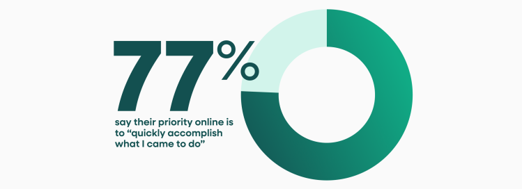
According to Fullstory’s 2023 consumer survey, 77% of global consumers say that their top priority when shopping online is “to quickly accomplish what I came to do.”
People come to your site or app to accomplish a task—whether to learn something, make a purchase, get work done, or do any of a million other things. Frustration arises when they encounter an obstacle that inhibits the completion of that task—like the site being too slow, confusing navigation, a broken element, etc.
It doesn't take much struggle during these critical moments for your users to disappear. Remember, almost two-thirds (64%) of global consumers say they’re likely to leave a site or app without completing a transaction if they encounter a digital problem or frustration.
Plus, your competition is just a click, tap, or search away. That's why understanding, identifying, and eliminating the causes of user frustration is critical for success online.
The 7 biggest causes of online user frustration
Now that we've identified the root of user frustration online, let’s look at some examples of the most common culprits of poor digital experiences.
1. Clunky, dysfunctional, dated, or just bad site or app elements and design

Every element showcased on your website or app has the potential to delight, help, confuse, or frustrate customers. The possibilities for what you can feature on your platform are virtually endless.
Listed below are just a few ways to frustrate customers with the design, UI/UX, or “stuff” you put on your site or app:
Eye-catching, look-at-me elements. These can create unnecessary distractions.
Auto-play videos or music. No one likes a panicked search for the mute or pause button.
Hiding or omitting functional navigation elements. E.g. "Where is [Search | Login | Support | Contact | some other basic thing]?"
Too-clever navigation. I.e., using unconventional words for common navigation elements.
Text/images/elements that are too big or small.
Confusing icons. I.e. icons that don't convey what they represent.
Graphics for text.
Absent calls to action. What is the "Okay, now what ..." for your users?
2. Performance

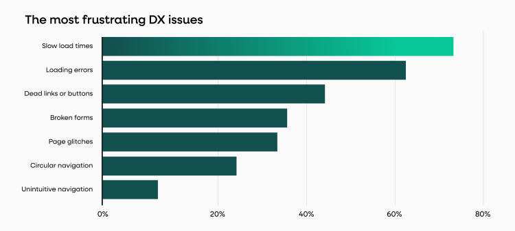
According to our consumer survey, 72% of global shoppers cite slow page load times as the most frustrating digital issue to encounter—more frustrating than dead links, broken forms, or page glitches.
Highlighting the importance of page load times even further, 47% of consumers expect a website to load in two seconds or less. Additionally, 40% will abandon a website that takes more than three seconds to load.
The takeaway from this data is clear: If your site doesn’t load in a timely manner, nothing else really matters—because shoppers will leave before they see it.
3. Aggressive tactics

There are some things that websites and applications still do that are likely to trigger frustration. While some tactics only become "aggressive" in a specific context, most should almost always be avoided. Here are a few of the most common aggressive tactics that are likely to make users angry:
Pop-ups, pop-unders, lightbox overlays, etc. How fast can you find and click the “X?”
Perhaps the most egregious offender that still gets a lot of playtime is the CTA to "sign-up for our newsletter" lightbox overlay—triggered on the first visit to a site after a handful of seconds.Ads! In particular, the ones that take over the entire screen with auto-play sound and no option to exit.
While advertisements may be a required revenue stream (and in-your-face ads are more likely to be seen, clicked, and valued), there's a tenuous balance. The rise in ad-blocking software is a solid indicator that many advertisers and publishers are taking ads too far.
Additionally, advertisements with clickbait thumbnails or titles can create cognitive load for your users, who must tease out if the "article" is real or an ad. Associating your brand with clickbait is likely something you want to avoid.Opt-in boxes, automatically checked. Automatically being opted-in to marketing materials may increase sign-ups, but it can also infuriate your users. Tread lightly.
Which one/where's the download button? While this should go without saying, attempting to trick users into clicking the wrong button sows distrust, at best. If ad placements on your site sit near critical buttons, consider how those advertisements may be used against your users.
There are other questionable tactics that can drive users up the wall. For a comprehensive overview of practices to avoid, refer to this list of "dark patterns."
4. It's broken

If your website or application isn't working, it's highly likely your users are going to notice. Granted, the site or application may not be working for lots of reasons. Here are just a couple:
User error. Sometimes customers can’t seem to figure out how to use your site or app. And that’s your fault, like it or not.
Bugs. Some part of the site is broken. Perhaps it’s a bug. Perhaps something else.
Dead links. No one likes a button that leads nowhere.
5. It's taking too long to do [x]

If users feel like the process to reach a certain page on your site (or point of conversion) takes too long or requires too many steps, they will quickly become frustrated.
Filling out forms or navigating the checkout process are two trouble areas that can rapidly turn into a bad user experience. Consider that 70% of consumers will abandon their shopping cart, 18% of those users citing the checkout process as being "too long/complicated.”
6. I’m confused and/or I have no idea what I’m doing

Have you ever interacted with a site or app and felt you should be able to do something obvious but can't figure out how? Circular and unintuitive navigation can cause significant frustration for online shoppers.
Most users will just leave, with only a select few making it over to help documentation, and only 43% will leave feedback if they encounter an issue.
7. My device is broken and/or my internet connection stinks, etc.

We've all been there—a slow (or missing) internet connection, a lagging, uncooperative device.
The kicker about this one is that it doesn't even have to be your site or app's fault for you to take the blame. What can you even do about this one?
One solution, though not an easy one, is to prepare the responsive design of your site for users who might have poor internet connections. Google, for example, encourages employees to test out their products over slower internet speeds by mimicking 3G (and other) connection speeds as options across the Google corporate Wi-Fi.
There are only imperfect solutions, if any, for this one. You may need to get creative.
Frustration detection—indirect vs. direct
Today, online businesses rely on two broad means of gauging customer sentiment, whether positive or negative (frustration or engagement). These two methods can be categorized as direct or indirect.
Direct methods to measure user frustration on the web
Direct methods of gauging frustration require user participation. “Tell us your dissatisfaction.” Tools like surveys, support tickets, contact forms, social media monitoring, etc. all function as a “direct” read on the customer experience.
There are three major problems with direct methods of frustration measurement:
1. They require the customer to do the hard work
That “work” is jumping through hoops—e.g. filling out contact forms, using chat support, placing phone calls, going on social media rants, whatever, to express frustration.
This process only works for customers who are willing to go through the hassle, which is likely a lower percentage of your overall frustrated customers. The result is data that is going to be slanted to a certain level of frustration. It very likely will miss low-level frustrations—the kind of things that customers will grumble through and not report.
2. They assume a customer can articulate their frustration
Have you ever been in a bad mood but you weren’t exactly sure why? Online experiences don't have to be in-your-face frustrating to be dissatisfying.
Many times it takes a number of events to create a frustrating experience—the kind of bad experience that drives a customer to respond to a survey and provide critical feedback. The problem here is that the content of the feedback may not articulate what exactly went wrong. The customer may only report the last straw, the first, or maybe some part in the middle.
3. They can bias results
The Hawthorne Effect is a real problem when it comes to polling users on their experience. If you’re not familiar, the Hawthorne Effect is “a type of reactivity in which individuals modify an aspect of their behavior in response to their awareness of being observed.”
Directly asking customers about their experience can be fruitful; however, it’s important to recognize its limitations. And the greatest limitation of directly asking customers about their experience is that the respondents will always be a limited set of users, often leading to selection bias. This means the feedback collected may not accurately represent the views of all users, as it primarily reflects the opinions of those who chose to respond.
Indirect methods to measure user frustration on the web
Indirect methods for measuring online experiences show a great deal of promise when it comes to understanding customer frustration. However, the metrics most often used to track frustration—metrics such as elevated bounce rates off a given page, average time on page, changes in conversion rates, etc.—have been blunt instruments and limited in their usefulness.
Consider bounce rate. Assuming the web page or app being measured isn’t a single-page app, bounce rate can only tell you if a customer hit a page and then left your site. Whether a given bounce is a sign of frustration is difficult to know with any certainty. Similar problems exist with metrics like average time on page, conversion rate changes, etc.
Giving a voice to unspoken frustration
At Fullstory, we assume the customer’s default reaction to having a bad experience online is—at best—to say nothing. At worst, they report their bad experience, but not to you—to others.
For most, bad experiences are never shared anywhere, and the result is a gap between the real and the reported online experience.
Fullstory is helping teams bridge that gap through session replay and search technology. The Frustration Guide serves to help you understand these tools so that you can reduce user struggle online.
The future of frustration detection is indirect
While indirect methods for measuring customer frustration online have been historically limited, advances in technology have created new ways to measure and understand the online customer experience.
That's where session replay comes in.
Replay is expanding what’s possible when it comes to understanding the customer experience online. How? Fullstory uses autocapture to log all user interaction data on a website or app in a privacy-first way. Then, Fullstory uses that data to create exact, context-rich recreations of a user’s session.
Session replay is useful for providing context for user frustration received directly through feedback. For example, you can connect a given user’s feedback to their specific session, so if a customer has a problem, you can watch their session and see just what was going wrong. Unfortunately, only a subset of users will provide direct feedback about frustrating experiences and many frustrating experiences will go undetected.
Session replay is extremely helpful when, say, a user calls the support center with a question or problem, and the agent can quickly call up their session to see what went wrong. However, it’s even more useful for understanding issues that are never reported at all.
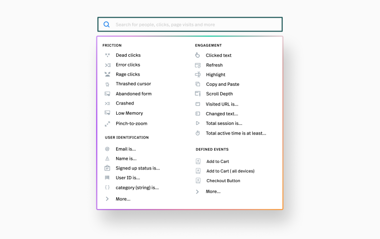
Fullstory automatically captures and indexes every interaction—including user behaviors that correlate to negative, frustrating online experiences. These events are easily searchable to developers, designers, customer support, and other teams. Once frustrated sessions and pages are identified, they can be researched and remedied with Fullstory insights.
2. Frustration signals captured in session replay
What online behaviors signal user frustration? While yelling, keyboard pounding, mouse slamming, exasperated muttering, and making obscene gestures at the computer screen (or mobile device) are all clear signs of frustration, they're not able to be captured in session replay. However, frustration can be signaled to Fullstory through on-screen behaviors—things like excessive clicking on specific elements or mouse thrashing, and many more.
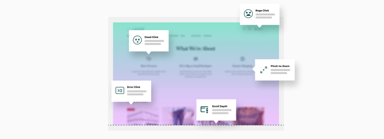
Fullstory indexes five primary customer frustration signals: rage clicks, dead clicks, error clicks, form abandonment, and thrashed cursor.
What are rage clicks?

Rage clicks occur when users rapidly click (or tap) on your site or app. Rage clicking is the digital equivalent of cursing to release frustration.
As a frustration event, rage clicks were first introduced by Fullstory in 2015 and have become an important way to identify frustrating sessions on websites and apps.
There are all kinds of web elements that can induce rage clicks, from graphics to text. Rage clicks are often the result of a mismatch between user expectations and reality—perhaps users believe clicking should trigger something specific to happen but nothing does, so they click some more.
For example, you can induce rage clicks by putting a screenshot of a Youtube video, complete with the triangle play button. Users will begin clicking away on “Play” but when nothing happens (it's just a screenshot!), frustration will result. Video can also induce rage clicking when it just doesn't load fast enough.
Critically, it's not easy to predict what might cause a rage click, which is why searching your user sessions in Fullstory for rage click events is so useful—you'll make unexpected discoveries.
Rage clicks captured in session replay
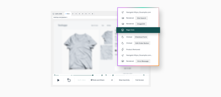
Below is a session recreation from our demo site "Fruitshoppe." In it, you can see how Rage Clicks are captured in Fullstory. Look for the click click clicking that occurs around 0:48 as the user rage clicks on the Purchase button (Notice also the rage clicks get the double whammy of creating a JavaScript Error in the console):
How Fullstory users put rage clicks to work
How are Fullstory users making use of rage clicks?
SpanishDict found users rage clicking on verb conjugations. Having made the discovery, they investigated further and began allowing clicks to create pronunciations and specific meanings. (Read more).
TravelPerk searches sessions for rage clicks, observes what part of their app is creating frustration, and then runs a broader search in Fullstory to research sessions that include interaction with the offending element. (Read more).
Appcues saw new users rage click simply because of a server-side delay that, when paired with confusing copy, resulted in users rapidly re-clicking a submit button:
From time to time, rage clicks search results in Fullstory may surface false positives (e.g. the most common false positive is when users are paging through a multi-page app, which can result in lots of clicks on the same element). You can either research these moments to determine if they are opportunities to improve your product (See From rage clicks to product improvements: how rage clicks reveal user desires for unsatisfied "Jobs-to-Be Done") or refine your rage click results using Fullstory's "ignore" capabilities.
More rage click resources
We've written extensively about rage clicks and if rapid-fire clicks are a focus for your research, you should take a read through these additional resources:
Rage Click Examples and Actions Examples of what can drive Rage Clicks as well as a case study from a Fullstory customer.
From Rage Clicks to Product Improvements. How to use Rage Clicks and the Jobs-to-Be-Done framework to reveal potential desire paths in your product.
Rage Clicks, the Basics. Our knowledge base article on Rage, Error, and Dead Clicks.
What are dead clicks?

Dead clicks are captured by Fullstory when users click an element on your web site or app but the click has no effect on the page. While dead clicks share some similarities to rage clicks, they do not require rapid-fire, back-to-back clicks to trigger Fullstory’s frustration detection.
Unlike rage clicks, the behavioral signal associated with dead clicks can be nuanced and subtle, which is why watching sessions that contain dead clicks is required to tease out theories as to what might be driving the behavior. Similar to rage clicks but to a greater degree, there is a chance that a dead click is not out of frustration—a false positive.
For example, users may be clicking the “background” of a web page in order to escape an overlay or assure focus is on the page. In other cases we see instances when dead clicks happen on paragraphs of text, which may signal focused attention by the user as they struggle to internalize a challenging concept.
Dead clicks are useful for teasing out these nuanced behaviors. Investigating them in Fullstory can result in discovering opportunities to help users.
More examples of what dead clicks can reveal
If you have Fullstory’s Page Insights pack, you have an additional way to surface dead clicks through click maps. This visual can be particularly useful for understanding where aggregated users are “dead clicking” on a given page on your site.
Using Page Insights with click maps to look at dead clicks is helpful by providing a visual of where users click most—with no effect on the page. Dead clicks are fascinating as they can hint at mismatches in expectations, confusion or enhanced focus, and many other reasons that can only be understood through replaying sessions.
What are error clicks?

When a user click triggers a client-side JavaScript error, Fullstory takes note, indexing these events as “error clicks.” Error clicks may or may not result in a user noticing something is breaking with the web site or app. Watching sessions that contain error clicks enables developers to understand the conditions that produced the JavaScript errors in order to diagnose and solve bugs.
Your users have capacity to put your app or site through the ringer, creating problems you never could have anticipated. By searching sessions for error clicks, you can make sure that all that “work” isn’t wasted, using session replay to reproduce bugs on-the-fly. Beyond bug reproduction, it goes without saying that error clicks are likely to be noticed by users, creating frustrating online experiences. Researching error click sessions should be a top priority for improving the online experience on your site or app.
What is thrashed cursor?

Thrashed cursor—or thrashing cursor or mouse—isn’t some pun for a user so frustrated that they’re losing control of their arms while shouting expletives. Rather, thrashed cursor is when users erratically move their cursor back and forth.
Rapidly moving the cursor over a page can indicate the user is getting exasperated with some aspect of their experience. Perhaps the site performance is slow or they are struggling to figure something out. Thrashed cursor is like a physical outpouring of some mental state in the user—and that state very likely could be frustration.
Like all frustration signals, there is a chance of a false positive with thrashed cursor. E.g. perhaps the user has a broken mouse or their computer is so slow that they’re thrashing their mouse in protest. The only way to deduce if thrashed cursor is signaling frustration is to watch a session and make some observations.
More examples of what thrashed cursors can reveal
Applying the “thrashed cursor” filter to a segment of sessions—e.g. to sessions that include a visit to a specific page on your site or app—can focus research to uncovering specific problems. Alternatively, combining “thrashed cursor” events with other frustration signals such as rage clicks, dead clicks, or error clicks could reveal particularly frustrating experiences—the kind that might lead you to reach out proactively to customers or identify the most odiously frustrating sessions.
What is form abandonment?

Filling out forms on any website or app can be time-consuming, friction-filled, and often downright frustrating. But it doesn’t have to be.
It’s not surprising that many users never make it through a given form on your web site or app. For those situations, Fullstory allows you to search for sessions that contain form abandonment. Watching sessions in which users bail on your forms can be illuminating as there may be specific fields that are tripping them up—perhaps they begin to fill out the form, get hung up on some part of it, and then jump ship.
Mining your sessions for form abandonment has a high probability of surfacing frustration. While those experiences may never be completely eliminated, researching them through session replay is a step toward reducing friction, and that can mean more users completing your forms.
3. Most frustrated sessions
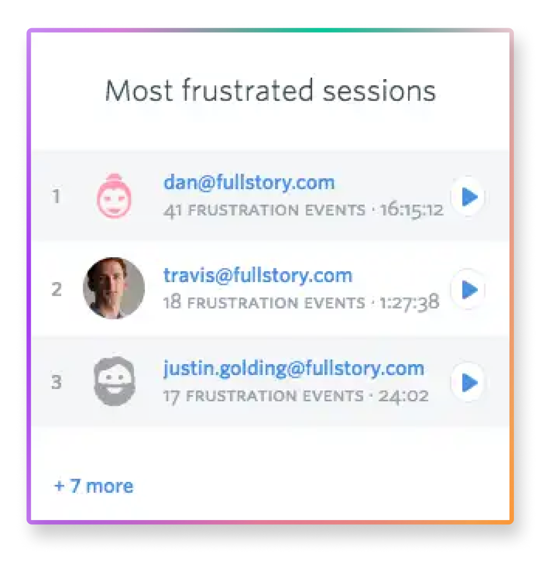
While each frustration signal in Fullstory can be used to research your customer's online experience on your website or app, you might find you'd like to look at the set of worst session replays among the thousands of sessions captured.
For that, you can use Fullstory's frustrated sessions card. This list of user sessions displays for any search or segment you create in Fullstory. Simply open Fullstory and look underneath the most recent session recreations for the cards. Look for the "frustrated sessions" card.
What is a frustrated session?
Frustrated sessions are identified by deploying machine intelligence against every matching session in your segment. Our proprietary algorithm looks for combinations of frustration signals—i.e. rage clicks, error clicks, thrashed cursor, etc.—contained within those sessions in order to determine which sessions contain the most customer frustration.
Let's say a user gets stuck clicking a checkout button. They click "checkout" but nothing happens. After a moment of patience, the customer proceeds to dead click around the page, clicks the button many more times, and for good measure, does some thrashing of their cursor. Fullstory looks at all these behaviors together, identifying the session as containing user frustration.
Replay any session replays from the Most Frustrated Sessions list and you'll jump right to the moments identified as frustrating.
4. Turning frustration into better products
If you reduce user frustration in the online experience, you can increase conversion rates, improve customer retention and reduce churn—all of which contribute to business or organizational success.
Reducing frustrating experiences online starts with awareness and ends with deploying the tools necessary to find, understand, and resolve frustration through product improvements.
To that end, product developers, engineers, marketers, designers, and more are using Fullstory's frustration signals to search tens of thousands of user session recreations. Through replaying these sessions, teams research user intent to see where expectations weren't met. From there, A/B tests and experiments can be used to drive website and app improvements.
Success during a time of ratcheting consumer expectations—competitors a quick click, search, or tap away—demands the use of new technology that can deliver the nuance necessary to understand and improve customer experience online.
Let's reduce user struggle—and grow your revenue—together.

