Our latest Fullstory user story comes from SpanishDict — the world’s leading Spanish ⇄ English translation and conjugation tool. We talked to CEO Chris Cummings to learn more about how SpanishDict uses Fullstory to improve the user experience when it comes to translation on their web app.
How to craft a UX worth returning for.
When you find yourself struggling with a website right out of the gate — clicking on the wrong buttons, trying to navigate to a page you can’t find, feeling frustrated when your rage clicks don’t take you anywhere — your relationship with that website is usually burned.
It may be hard to accept, but there are people out there having exactly those kinds of experiences with your site, right now.
Frustrating experiences prevent users from seeing a product’s potential value but can be avoided by remembering that users came to your site to get a job done. The easier and more delightful it is for them to accomplish what they came to do, the more likely they are to return.
The first step in improving user experience is to discover what problems users run into that prevent them from accomplishing their goal. When SpanishDict dug into their user’s journey with Fullstory, they were able to identify the following problems:
Users were clearly telegraphing their need for a feature that wasn’t provided.
Users were having trouble getting started using the product upon their first visit.
Users were having trouble seeing the full, existing functionality of the product.
Let’s take a closer look at each of these problems, and how SpanishDict used Fullstory to understand each one in order to improve the online experience for their users.
What features are users showing you they want?
Creating a great user experience means providing users with everything they need in their journey. Sometimes, your customer will show you something you hadn’t thought of on your own. And if you’re paying attention, you can learn from what they’re doing.
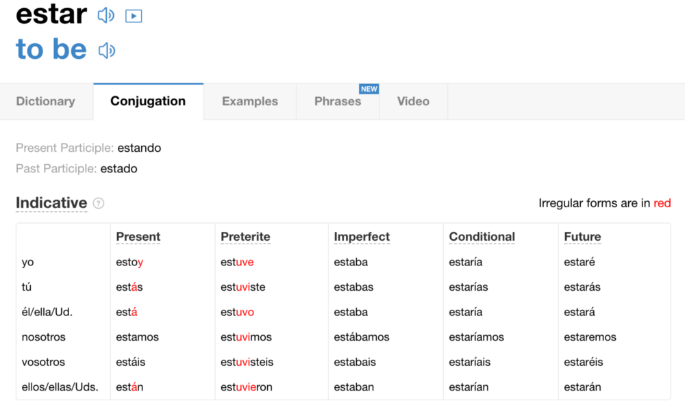
The team at SpanishDict knew that many users were turning to the website to learn how to conjugate verbs. The site made it easy for users to learn these conjugations: all a user had to do was type a verb into the website’s search bar, and they’d receive several tables of conjugated verbs for each verb tense.
To better understand how users interacted with the conjugation tool, SpanishDict used Fullstory’s Page Insights Click Maps to understand where users were clicking most on the conjugation results page (Click Maps are a graphical overlay that enables you to see aggregated click insights on web page elements).
To the team’s surprise, they found many people were clicking on the conjugated verbs even though they weren’t links. Users wanted more from the table of conjugations than what the page was giving them.
SpanishDict investigated further, speaking with users and soliciting customer feedback. They quickly learned that many users were trying to see the translation and pronunciation of each individual conjugation.
Watching user behavior combined with the feedback prompted the SpanishDict team to create a mouse-over translation feature to show users what each conjugated verb specifically means. They also added an audio feature for each conjugated verb so users could listen to the pronunciation.
These changes allowed SpanishDict to help customers reach a larger goal. Users didn’t just want to know how to conjugate verbs. They also wanted the surrounding knowledge necessary to use these words. Adding these features drastically improved the experience of users trying to accomplish this goal — and SpanishDict saw an increase in usage and retention from these users.
Find bugs that block users’ path to success.
The simplest issues in page layout or site navigation can obstruct your user’s path to accomplishing their goal. Removing these obstacles gets your product out of the user’s way, yet until you experience the product from the user’s point of view, you may be blind to these roadblocks.
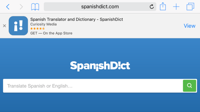
SpanishDict was able to remove one of these obstacles when they noticed something strange about new user behavior — particularly on their mobile site. People visiting the homepage would fail to interact with the search/translation bar.
The team investigated the problem with Fullstory’s Session Replay. When they watched session recordings of first-time visitors to the homepage, they noticed that their banner ad for their app was pushing the search bar down and off the page. It wasn’t clear to users how to begin — or what to do on the website.
This was detrimental to the user experience. The search bar is the most prominent feature of the product, enabling the user to engage with SpanishDict right away and start translating words. It was even more essential for the search bar to be visible on the mobile site. A huge component of the site’s value is in giving users the opportunity to translate and conjugate words on the go, whenever they need them.
Once they saw this bug, they were able to fix it by moving the search bar up so that both the ad and the search bar were visible in the landscape view of the mobile site.
As simple as the fix was, SpanishDict was only able to understand it through watching user sessions through Fullstory. This simple fix lead to an immediate rise in user engagement.
Make sure your site shows the product’s full functionality.
When you’re always looking at your product from the development, marketing, or sales side, you know all of its best features like the back of your hand. But those features might not be so obvious to a user who hasn’t seen the product roadmap or sat in on marketing meetings. The product has to make its full functionality clear and discoverable to users who are completely unfamiliar.
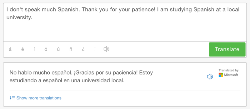
One of the SpanishDict’s most helpful features is the ability to translate whole sentences in addition to one-off word lookups. For example, you can type an entire sentence and then translate it in one query:
Unfortunately, SpanishDict discovered through session replay that mobile users were having a hard time using the search bar to translate longer sections of text. The team saw that limitations on the size of the entry field made it hard to use for longer sentence inputs.
In other words, the box would remain the same size even if a user continued to type beyond the box’s visible capacity and the user would suddenly find themselves unable to see what they were writing. Users would quickly give up.
SpanishDict took this newfound insight as an opportunity to innovate on the product and developed an auto-adjusting text box that would expand as necessary if a user types in a long query on Mobile:
The new, dynamic input makes it simple for users to input longer sentences for translation.
By making this change to the text box on both the desktop and mobile sites, SpanishDict saw an increase in users translating long sentences and paragraphs.
Understand the user’s perspective to improve the online experience.
Using Fullstory to dig into user experiences on their site, the SpanishDict team was able to identify the problems that prevented users from getting all of the information they need to feel comfortable navigating between Spanish and English.
These problems only required small fixes to make a significant impact on the user’s understanding and use of the product, yet they would have remained unknown had SpanishDict not used Fullstory to uncover them.
Muchas gracias to Chris and SpanishDict for sharing your story!
Interested in hearing more ways Fullstory session replay and Click Maps are used to build better products? Want to share your story? Reach out — email thefuture@fullstory.com!


