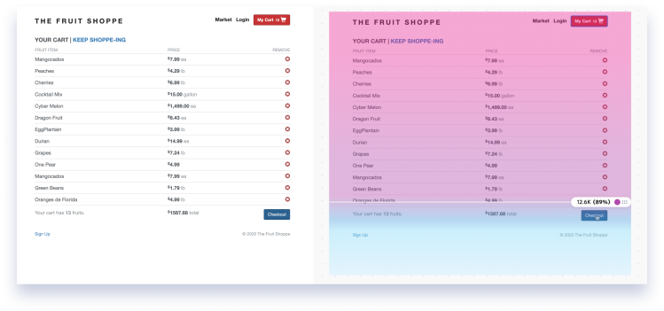
You might have heard of heatmaps, but do you know the importance of a scroll map?
It could be the most important heatmap for the success of your website.
In general, heatmaps are one of the most powerful user behavior tools in a marketer's or designer’s toolbox. People all over the world analyze heatmaps to improve bounce rate, increase customer retention and learn more about how people use their service—all so that their site or product better help their users.
There are different types of heatmaps, and each tracks different user interactions on a responsive website, like clicking and scrolling. We are going to focus on the importance of scroll maps and what they can do for you.
What is a scroll map?
A scroll map (also called scrollmaps or scroll heatmaps) is specifically designed to take data on how visitors scroll through a part of a website, to help identify UX improvements, make changes, and increase conversions. This insight shows the section of a webpage that a visitor or a viewer is scrolling through the most and least.
Scroll maps are a type of heatmap that provide insights into how visitors are engaging with your website so you can spot problems and make changes. Think of it like visual product analytics.
This type of a heatmap is useful in many different ways, including:
Driving traffic to specific parts of your site
Instantaneously identifying popular content and data patterns
Simultaneously identifying the best time to act on issues.
Like heatmaps, scroll maps can be collected on desktop and mobile devices—and color is used to represent the most and least scrolled parts of a page. They generate scrolling “heat zones” of your website or app pages from top to bottom.
Scroll maps also include percentages of how many visitors see different parts of a page and an average fold score showing what percentage of visitors see the part of your web page element that is most viewed.
Heatmaps 101: What is a heatmap?
Find out what heatmaps are, how they started, how they’re created, and how you can use them to make data-driven decisions
How to use a scroll map
Using a scroll map has many different benefits:
Capture and keep visitor attention
With a scroll map, you can find out where you’re losing visitors’ (and customers’) attention—by where they are landing on your page.
At first glance, your scroll map will show you how far down the page users go (and what captures users’ attention), which typically equals how interested they are in your brand.
The bottom line—the colder the color, the fewer people will have seen that section of the webpage. It may be time to optimize.
Spot false bottoms
It's important to understand the concept of "false bottoms" on websites—when a user thinks their scrolling has come to the end of the page when it hasn't, or when a user doesn't realize there's more content lower down the page.
The "false bottom" is often caused by formatting—whitespace, line breaks, or blocks in the content and a scroll map can be used to "depth test" a page to check for false bottoms. That simply means testing how far down the page to check.
The results of a depth test can help you identify a specific element of a page, and if it needs to be moved higher up due to lack of engagement.
Discover if users see what’s above the fold
A scroll map is a tool that measures the average fold on a web page by automatically calculating where people scroll the most—and then stop, for both desktop and mobile users. The fold line is basically the cut-off point at the bottom of the screen or web browser before scrolling.
By looking at scroll map average fold data, you can place important elements above the fold in a way that works across devices. This graphic information can help increase conversions on calls to action exponentially.
Figure out if users can find what they need
Simply put, users scroll to find what they need, so your scroll map can detect that on a level you may not be. Here are a few ways you can help your visitors find what they need on your website with a scroll map:
Add filters to category pages to improve the usability
Design less for efficiency
Optimize scrollability
When a user is scrolling, but can’t find what they need—you need a scroll map.
Learn if your page offers a good cross-device experience
Collect your own scroll map data to find out how your viewers are behaving. From there, you can understand both your web and mobile experience better.
Scroll data is there to help you design pixel-perfect user experiences and you can refer to this data to find exactly where you need a CTA to capture users' attention on desktop and mobile.
The pros of using scroll maps
Scroll maps are excellent for optimizing a visible area of a website above the fold.
Watching key information helps you discover whether users find what they are looking for or not.
Scroll maps help to develop strategies to make more visitors scroll further down to the bottom of the page.
Watching the scrolling behavior of users can help design a long landing page.
A website scroll map helps you understand how to prioritize content and where to place important elements.
Scroll maps are an easily understood form of data visualization, and a good springboard for combining qualitative and quantitative data.
The cons of using scroll maps
Scroll maps can’t help you measure the effectiveness of the elements on your website.
They also don’t compare how users interact with different elements or show you page impressions.
Scroll maps don’t always provide accurate data because of aimless, scrolling activity.
When it comes to mouse movements, related tools like click maps can be a more reliable representation of user engagement rather than scroll maps or move maps.
A scroll map may not be very useful for web pages with dynamic elements.
How do Fullstory's scroll maps work?
Within Fullstory, the Page Insights mode lets you see quantitative data, in aggregate, for the specific pages that come into view while you're playing back any user's session. Scroll maps give you a new type of insight based on the depth of visitor engagement. When the scroll maps feature is active, Fullstory detects the page in view and generates stats based on the maximum scroll depth for all views to that particular page.
Every scroll map includes a color gradient overlay that allows you to see, at a glance, where drop offs happen. This is valuable for understanding exactly where users lose attention and how you should prioritize content in terms of hierarchy.
For example, maybe your checkout button is the most important call to action on your page. You can use Scroll Maps to verify that this CTA stays within view for the segment of users you've defined.
How to get started with Fullstory scroll maps
First, find any session in Fullstory and hit play. From playback, click Page Insights to open the click maps view.
From there, click on scroll maps and then place the map marker at any point on the page to see, in aggregate, how many visitors scrolled to that depth.
Note: Scroll maps work best for pages that are contained from top-to-bottom with no infinite scrolling or sections with their own independent scroll behaviors. That means they usually aren't ideal for single-page apps with lots of sections that scroll on their own or any page where you click a "Load more" button to fill in more items.
Further reading: Other types of heatmap examples any team should pay attention to.
Dive into heatmaps with Fullstory
Heatmaps are a critical tool for enhancing digital experiences. Alongside scroll, error click, dead click, and rage click maps, Fullstory lets you analyze user funnels and conversion rates, watch session replays, and more.


