Article summary: In this post, we walk through how the Fullstory product team used the Fullstory platform to uncover and address friction in our user login flow. This content is particularly relevant for SaaS product teams.
We’ll be the first to admit that watching user sessions in Fullstory can sometimes be painful. Really painful.
The ability to see your user struggling to navigate your online store or software is valuable and telling, of course, but it can also be a deeply cringey experience for product and engineering teams.
Those hard-to-watch sessions often feel like both a blessing and a curse:
Thank goodness we’ve uncovered this glaring issue in our digital experience!
But we hate thinking about all the users who have encountered this problem on our app...
However cringe-worthy, ignorance is not bliss when it comes to customer experience problems, and the Fullstory platform is designed to reveal those unknown points of user frustration. Just like our customers, Fullstory teams use Fullstory to identify issues within our own product.
That’s how we learned about (and fixed!) a less-than-ideal login flow—a critical moment in the user’s journey that can often make or break engagement and adoption. In this post, we explore how we did it and offer a roadmap for other SaaS product teams.
Step 1: Discovering and understanding the problem in the user login flow
Fullstory is an ‘experience’ platform; it exists to help teams make digital products and experiences more usable. Which means we think and talk about customer experience (CX) a lot. We define customer experience as the interactions and exchanges a customer has with a business and the way that customer perceives that businesses, from first touchpoint to last.
With experience in mind, the Fullstory product team is constantly monitoring how users interact with our platform, across multiple touch points. Recently, we uncovered that users were running into all sorts of issues and confusion before they’d even accessed Fullstory—in that first touchpoint, as they attempted to log in.
The original user login experience
As with many SaaS platforms, there are two primary ways to log in to Fullstory: with a username and password (which is used by most of our business plan customers), or with a single sign on (which is used by many, but not all, of our enterprise plan customers).
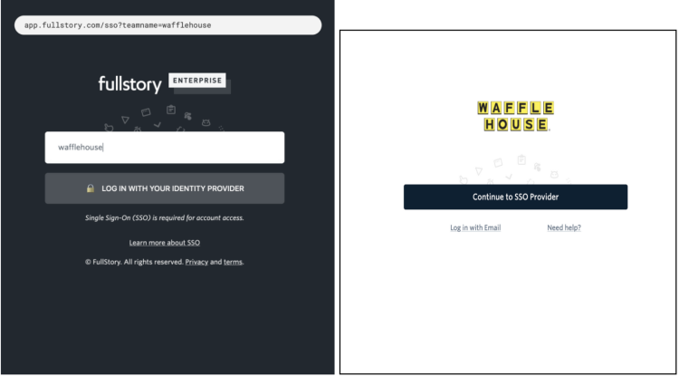
Previously, when a user navigated to the Fullstory website and clicked “Log In” in the top right corner, they were taken to the standard login page, which requested a username and password. If an enterprise-level single sign on (SSO) user attempted to log in here, they would be denied because their organization requires SSO.
On the flip side, if an enterprise-level non-SSO user landed on the standard login page and saw the button to use SSO, they would often select that option, thinking it was correct. And again, the login attempt would fail.
And finally, when an enterprise-level SSO user did navigate to the correct login page, they were asked to input the team name that was associated with their organization’s account. After noticing that users seemed puzzled by the team name, we pre-filled this field for clarity, but users would erase it and type in their email address. And, of course, the login attempt would fail.
All too often, a login session looked like this:
As soon as the product team identified the login as a potential problem spot, they built a Segment inside Fullstory to identify users who had seen one or more error messages, and distilled that information down into three main issues:
Business plan customers mistakenly navigating to the enterprise login page
Enterprise plan customers mistakenly navigating to the standard login page
Enterprise plan customers experiencing confusion due to the team name input
Step 2: Determining the scale of the issue
Using this Segment, the team could instantly see session replays of customers struggling or altogether failing to log in to their Fullstory accounts. But to build a business case for prioritizing a fix, they needed to go beyond session replay and extract some hard metrics around this issue.
By searching for sessions in Fullstory where users encountered any of three error URLs, they discovered that nearly a third of our users were experiencing error messages on the login page. Roughly 30% of Fullstory users were unable to log in to the platform on their first attempt, and sometimes not even on the second, third... or tenth.
Ouch.
As a company that champions the idea that everyone benefits from a more perfect digital experience, it was a blow to realize that we’d been giving a pretty darn bad one to our users in this particular workflow.
Armed with Fullstory data, the team began examining Fullstory session replays and brainstorming how to make the login flow more intuitive and user-friendly, keeping two questions top-of-mind:
How can we make sure the login experience is equally excellent for both business and enterprise-level Fullstory customers?
And furthermore, how can we make sure we are going above-and-beyond to provide a login experience that exceeds our enterprise-level customers’ expectations?
Step 3: Designing a solution to improve the user login flow
In order to think through how to create an ideal login experience for every customer, we built a flow chart, incorporating every user path that can occur from the login page. That visualization, paired with the previously determined problem types, led us to identify three key elements to implement into the new login flow:
1. Put users on the correct login path based on their email address
As mentioned above, there are two ways a user might log in to their Fullstory account, depending on how their organization operates: by using a password or with single sign on.
The previous login experience asked the user to guess which option their organization used, which often led to failed login attempts. Instead, the product team proposed automatically pushing the user into the correct login flow using their email address.
In the new flow, a user is prompted to enter their email address and is then routed appropriately based on their organization’s login preference.
From there, password users are prompted to enter their password, while SSO users are redirected to their enterprise login page. The user doesn’t need to know which of these is their login method; Fullstory does the work for them, eliminating password vs. SSO confusion.
By routing the user to the appropriate flow from the first step, we can ensure that the login process is seamless and quick for both business and enterprise plan customers.
2. Build a dedicated login page for each enterprise customer
Most product folks know that—particularly in larger companies—software can quickly become shelfware. If you can’t facilitate adoption and engagement at scale, you will struggle to get value from what could be an extremely valuable platform. Like most software providers, we are constantly working to help our customers get into our platform and get as much value from it as they can.
Because our enterprise customers are generally large companies that are trying to promote Fullstory adoption across many individual users, we hypothesized that a custom login experience would help motivate users to get into the platform. So as a part of our login flow reboot, we decided to build custom login pages for each enterprise customer.
These branded pages are bookmark-able and require no input, creating a consistent, premium login experience. By eliminating the requirement to enter login credentials, we eliminated the possibility for users to fail to log in. This makes the barrier to enter Fullstory for any enterprise user extremely low, meaning that individual users are more likely to get into the platform and start using it.
3. Provide more informative error messaging
We all know the feeling of entering a username and password and receiving the (completely unhelpful) message, “Login failed.” Which part failed? Is it my username or the password that’s incorrect? Did I change my password recently? Do I even have an account?
While the ideal is a completely error-free login experience, there will always be unforeseen issues that occur. But even if we can’t eliminate errors entirely, we can provide increased clarity by making our error messages more informative for users.
In the new login flow, we implemented error messaging that actually provides information on why the login failed—whether the user entered the incorrect password or because they simply don’t have a seat in their organization’s Fullstory account.
When a login does fail, the user will have the information they need to rectify the situation. This additional clarity reduces stress on our support team, as we can more easily identify whether the user needs to speak to us or to their own account admin.
Step 4: Monitoring the results of the new user login experience
In order to monitor how these changes impact user experience, the team built a Dashboard in Fullstory. There, they can easily monitor the Metric that calculates the percentage of users who experience error messages.
Since rolling out these updates, we’ve seen the percentage of users who receive (newly informative) error messages on the login page cut nearly in half, down from around 30% to about 17%. This indicates we are providing a quantifiably better first experience for our users.
And with our login flow Dashboard, we can continue to keep a pulse on those metrics.
How to apply this account to your work
If you’re already a Fullstory user, here are some practical steps for using Fullstory to improve your own login flow:
Examine: Build an error messaging Segment in Fullstory to see how many of your users are struggling at login. If it’s a high number, watch sessions to pick up on trends of where exactly things go wrong. (How many sessions should you watch? (How many sessions should you watch? The short answer is five.)
Build: Based on your discoveries, establish what an ideal login session would look like on your site or app, and implement changes as needed. For us, that involved creating a detailed flow chart. This could result in small tweaks to your error messaging, or a complete overhaul, as in our case.
Observe: Build a Dashboard in Fullstory for at-a-glance metric monitoring. Ideally, the number of users who receive error messaging will decline after you initiate changes to the process, but the Dashboard will allow you to easily see what works or doesn’t work and iterate accordingly.
If you’re not already a Fullstory user but want to learn more about the platform, schedule a demo to get started.
Do you have other ideas for how to create a more perfect login experience for your users, or have you put any of these ideas into effect at your organization? Let us know about it at thefuture@fullstory.com.


