Key takeaways
Website heatmaps are a powerful way to understand what your users do on your website—where they click, how far they scroll, what they engage with, and more.
Click maps and scroll maps are the most popular types of heatmaps, but there are many other types.
UX designers, marketers, analysts, and product teams can all benefit from utilizing heatmaps.
What is a heatmap?
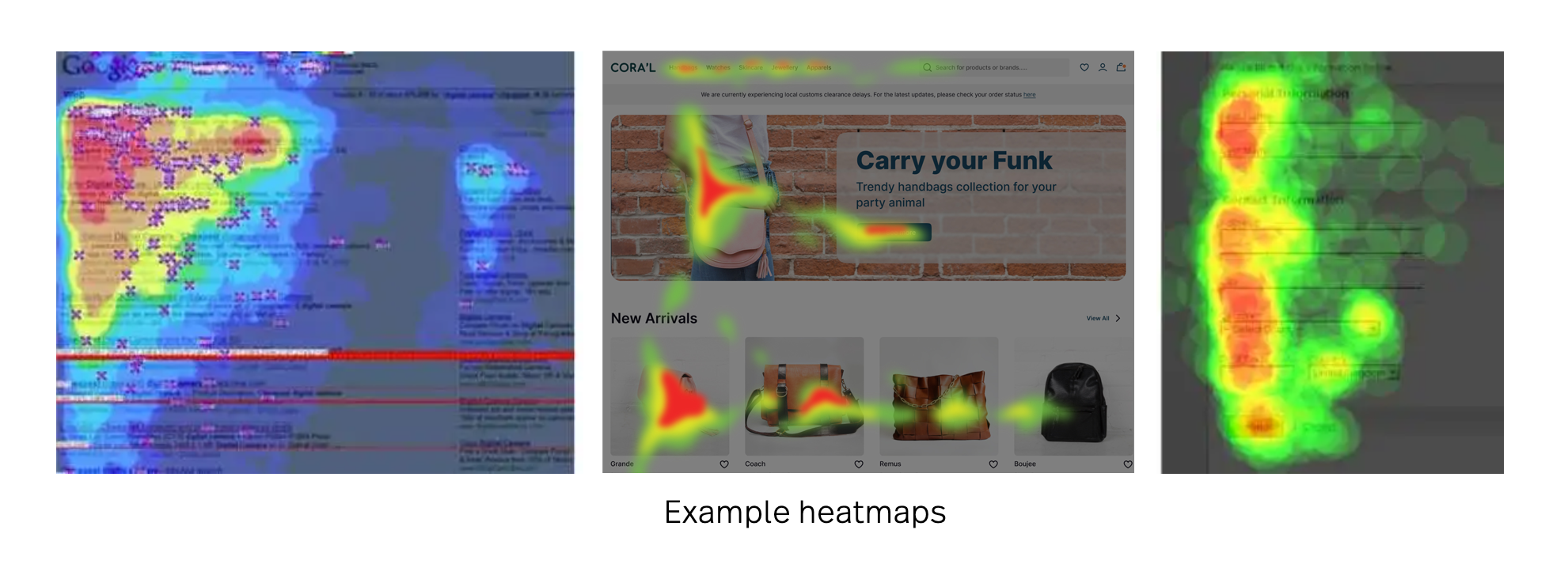
Heatmaps are color-coded visual maps that overlay a page to show where visitors or viewers click, tap, hover, and scroll, instantly revealing high- and low-engagement areas you can optimize for usability and conversions.
Heatmaps can be created manually, but most are generated by heatmapping software.
Heatmaps date back to the late 1800s when Toussaint Loua used a shading map to show social demographic changes across Paris.
Computer heatmapping technology was first trademarked in the early 1990s by software designer Cormac Kinney, who created a tool to visually display real-time financial market information.
Heatmaps can use different color schemes, like grayscale or rainbow. In grayscale maps, darker areas show more activity, while lighter areas show less.
Rainbow maps are often preferred because people can see more color variations than shades of gray. In rainbow maps, warmer colors like red and orange highlight popular areas, while cooler colors like blue and purple show less-used sections
Looking for a video? Watch a detailed analysis of an online retail website's heatmap.
What do heatmaps show?
Heatmaps show how users interact with your website. They provide visitor behavior insights that can help you improve conversion funnels, increase conversion rates, reduce bounce rates, and even boost sales.
For example, a map may reveal that nobody is tapping one of your most important page elements, leading you to consider a new design to increase engagement.
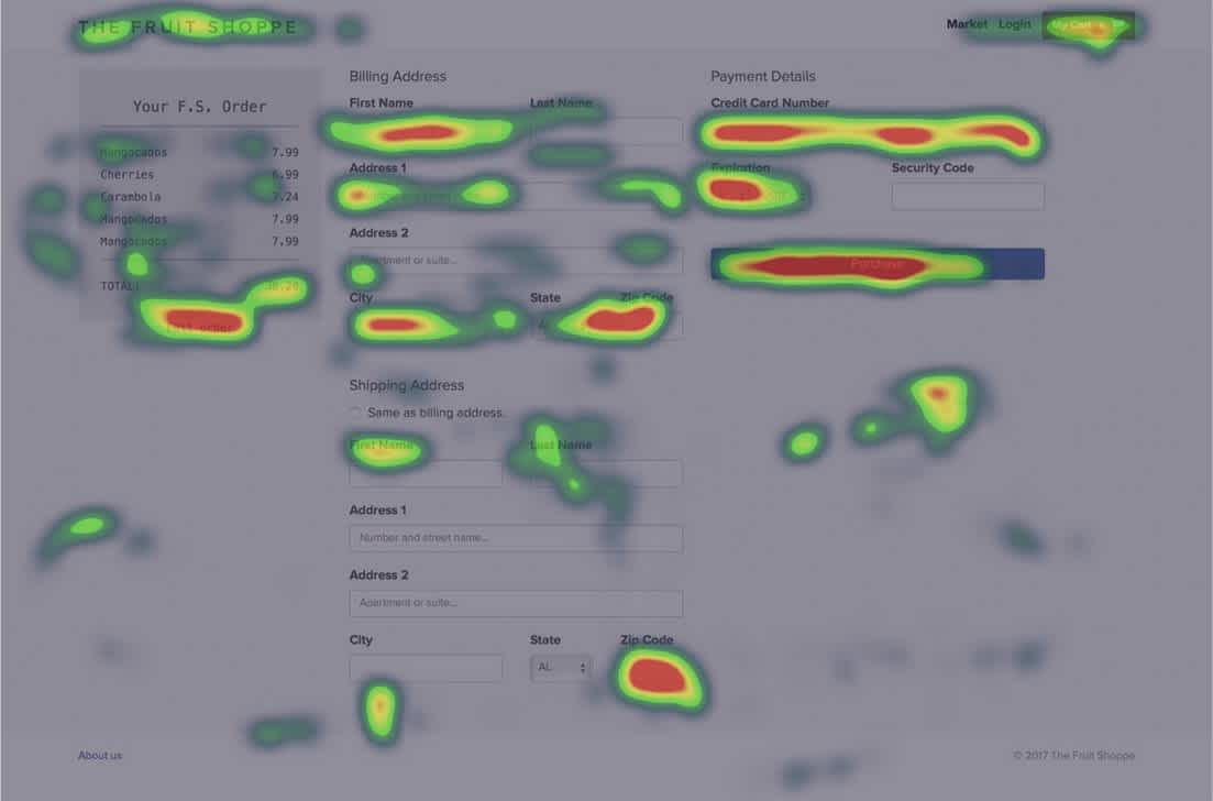
Different types of heatmaps provide insights into different aspects of user behavior, such as engagement, customer sentiment, and interaction patterns on your website.
How do heatmaps work?
Heatmaps generally fall into two categories: interaction and attention.
Interaction heatmaps measure different types of engagements and use tracking codes to record interactions between a user and a website, like clicks, scrolls, and mouse movements.
Attention heatmaps monitor how users look at your website content by monitoring or predicting their eye movements.
Types of website heatmaps
Several types of website heatmaps are designed to reveal specific aspects of user intent and behavior. Below is an overview of some of the most common types.
Click maps
Click maps are one of the most widely used types of website heatmaps. They show where users click on your page, offering valuable insights into how people navigate your site.
Click maps help you:
Identify and monitor the effectiveness of CTA buttons.
Pinpoint and remove areas causing user friction or increasing bounce rates.
Uncover the most clicked-on sections of your site.
Track conversion rates for both new and returning visitors.
However, click maps aren’t perfect. Be mindful of potential issues like accidental logins, frustrated clicks, or device compatibility problems that can skew data analysis.
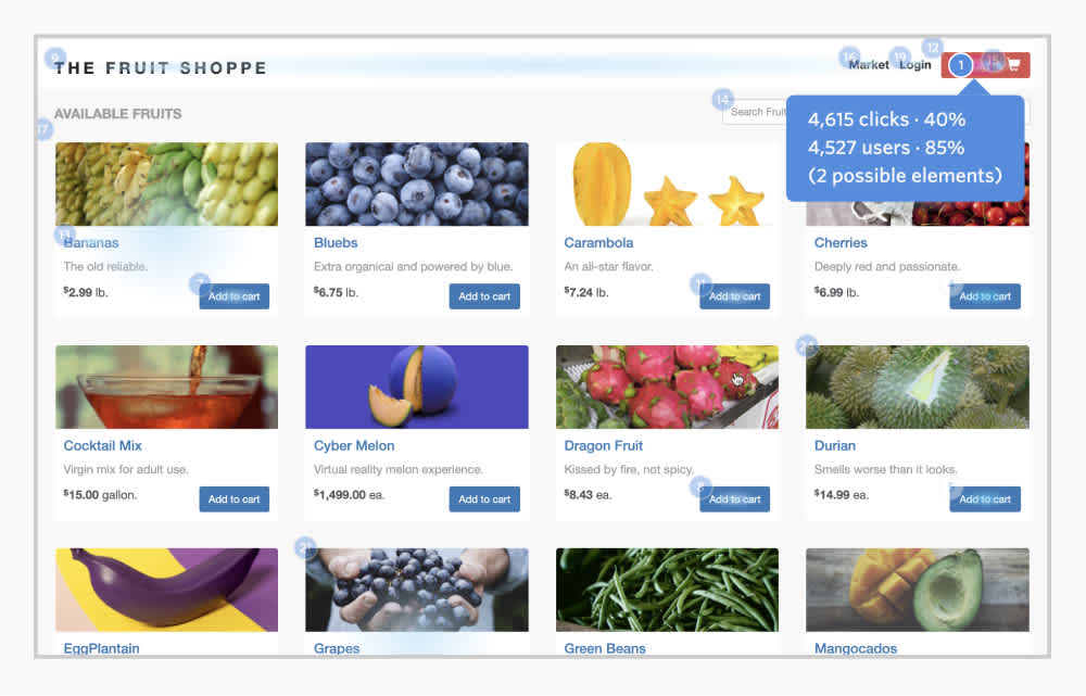
Like any heatmap, click maps work best when combined with other data sources. Pair them with insights from product analytics tools, user analytics platforms, Google Analytics, UX surveys, and more to understand the full story behind user behavior.
Further reading: Behavioral data doesn’t just show what users do—it reveals why they do it. Learn what behavioral data is and why it’s important.
Scroll maps
Scroll maps are a visual representation of visitors’ scrolling behavior on a web page. They tell you:
How many visitors scrolledto the bottom of a page.
How many visitors scrolled but stopped short of the bottom of a page
How many visitors abandoned a page.
What percentage of users scrolled to certain depths on a web page (for example, 34% of visitors scrolled 50% of the way down a page, 13% of visitors scrolled all the way to the bottom, etc.).
Scroll maps help you see how far visitors scroll before leaving a page, revealing whether important content is being ignored and helping you understand how to maximize a page’s impact. If, for example, you find that only 25% of visitors scroll below the fold (below where your screen cuts off the rest of the page), you know that you need to put the most important content at the top of the page.
Scroll maps can also reveal false floors (or false bottoms), where visitors mistakenly believe they’ve reached the bottom of a page when they haven’t.
When using scroll maps, always look at metrics for both desktop, tablet, and mobile users, as behavior can vary across devices.
Mouse-tracking heatmaps
Mouse-tracking maps show general mouse movement across a web page, helping you understand customer sentiment. They can reveal where visitors are hesitating, hovering, or thrashing their cursor.
Mouse-tracking can help:
Spot hover patterns that indicate friction or frustration.
Optimize pages with complex or dynamic elements.
Evaluate the relevance of search results based on click patterns.
It’s important to remember that cursor movement doesn’t always align perfectly with where users are looking, which can lead to misleading insights.
Eye-tracking heatmaps
Eye-tracking heat maps user sensor technology to track users’ eye movements, blinking, and even pupil dilation as they interact with a web page. Eye-tracking heatmaps can help you:
Identify where users' attention is naturally drawn.
Position key elements in areas that receive the most visual focus.
Improve layout usability by understanding gaze patterns.
However, eye-tracking tools are expensive, often resulting in data based on a small user sample. Additionally, some users are wary of eye tracking and use camera covers to avoid being surveyed.
Error click heatmaps
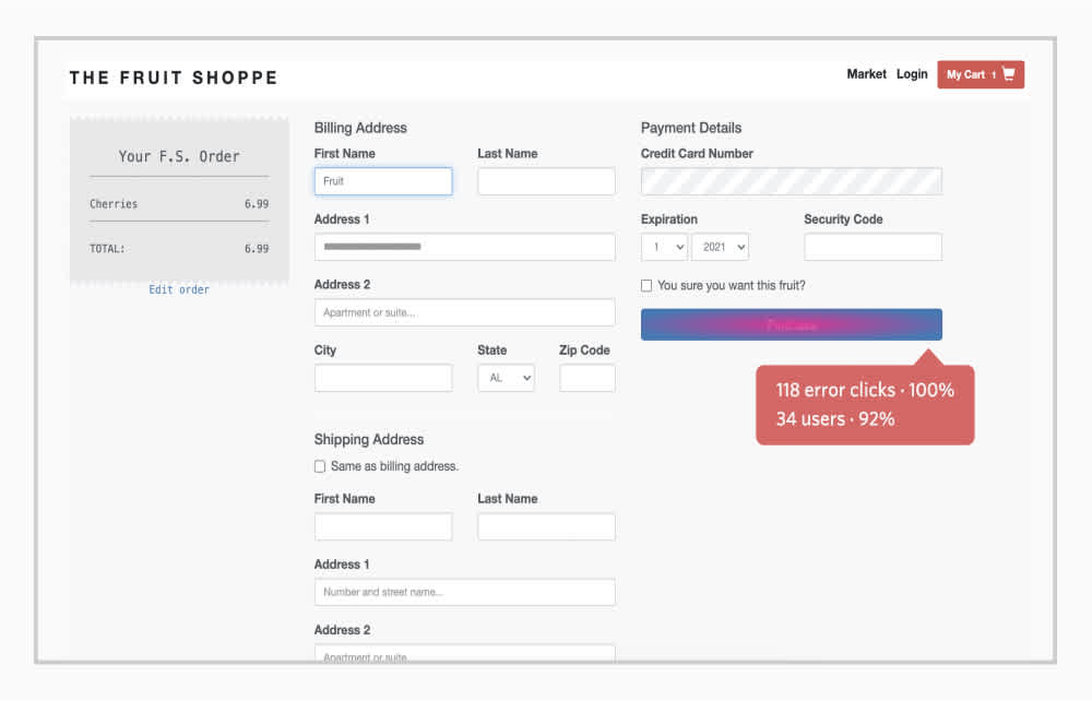
Error clicks occur when a user clicks on an element of a web page that triggers an error, like a client-side JavaScript issue or a console error.
Error-click maps help you:
Quickly uncover bugs and glitches.
Investigate recurring console errors or exceptions.
Understand which errors are impacting users the most.
By identifying and addressing these issues, error-click maps help ensure your website runs smoothly and meets user expectations.
Rage Click™ heatmaps
Rage Click™ heatmaps highlight areas of user frustration by tracking when users rapidly click or tap on an element of your site.
Rage click maps help you:
Identify elements causing user frustration.
Spot malfunctioning buttons or static elements that are misinterpreted as interactive.
Prioritize fixes to reduce friction and improve user satisfaction.
Learn where your users are rage-clicking
Are you losing customers to bad digital experiences? Fullstory helps you uncover rage clicks and other frustration signals. Start turning insights into better experiences—request a demo or start a 14-day free trial today.
Dead click heatmaps
Sometimes, users mistake unclickable elements on a website or app as buttons and tap them, expecting something to happen—this is called a dead click.
Dead click heatmaps can help you:
Identify elements users mistakenly think are interactive.
Spot opportunities to clarify design and reduce confusion.
Track behavioral trends over time to uncover new optimization opportunities.
Addressing dead clicks helps create a more intuitive user experience and improves conversion rates.
AI-generated heatmaps
Instead of showing actual user behavior, AI-generated heatmaps use artificial intelligence to predict user behavior.
AI-generated heatmaps can help you:
Predict where users will look when they first land on your site.
Determine the best placement for critical elements like CTAs.
Cut costs, as they are generally more affordable than eye-tracking heatmaps.
These heatmaps are up to 95% accurate, but they may not perform well on sites with low traffic or engagement.
You don’t have to choose just one type of heatmap. Leveraging various types can give you a well-rounded understanding of user behavior and help you make more informed decisions for your website.
Why (and when) to use a heatmap
Website heatmaps help you track visitor behavior visually so you can make your improve your site around your goals. They highlight which site areas people are engaging with, which areas are working, which aren’t, and which areas your users are avoiding.
These insights help you make data-driven changes — you're acting on data, not just guessing.
At many organizations, website heatmaps are part of larger conversion rate optimization (CRO) efforts, since they’re mainly used to improve conversion rates.
Website heatmaps can help you determine if:
There is important content on a page that visitors aren’t getting to
Users are having trouble finding or seeing certain CTAs
Users are experiencing issues based on device type or browser
Non-clickable elements are creating distractions that harm conversion (as shown in the video below)
Further reading: How to use session replay for conversion rate optimization
How to create a heatmap of your own
There are plenty of heatmapping tools to choose from, so it’s important to compare your options. Start by identifying which pages you want to analyze and what type of heatmap will provide the insights you need.
Look for a tool that offers multiple types of heatmaps, not just scroll or click maps. Having access to a variety of maps allows you to combine insights and make more informed decisions for your site.
Heatmap tools
Some popular heatmapping tools include:
Fullstory
Smartlook
EyeQuant
Attention Insight
Dragonfly AI
Mouseflow
Who can benefit from using heatmaps?
Heatmapping software provides a wide range of valuable data. Here’s how different departments can use that data to their advantage.
UX designers
Heatmaps help UX designers understand how users interact with their site or app. They’re great for usability testing, showing if content encourages action, revealing behavior patterns, and confirming if CTAs are placed effectively.
Heatmaps also assist with A/B testing. If something doesn’t perform as expected, heatmaps can help explain why. Even when tests don’t go as planned, the right data turns failures into valuable learning opportunities.
Marketers
For digital marketers, the competition for attention is fierce and traffic acquisition costs (TAC) are rising, so maximizing the value of site traffic is essential.
Heatmaps help marketers see which parts of a page or ad grab attention and which are overlooked. With this insight, they can place key elements—like special offers or CTAs—where they’re most likely to be seen.
Digital analysts
For digital analysts, heatmaps bridge the gap between data and actionable insights. They combine qualitative and quantitative data, adding depth and context to your analysis.
While other tools might only allow you to count clicks on a button, heat mapping tools can help you understand what happened before, after, and in between those clicks—critical information for understanding your user’s behavior.
The visual nature of heatmaps also makes it easier to interpret complex insights by turning raw data into a clear story.
Product teams
Heatmaps give product teams valuable insights into how users interact with features, helping to identify what’s working and what isn’t. For example, they can reveal whether users are engaging with a new feature or struggling to find it, allowing teams to refine designs and priortitize updates.
By understanding user behavior through heatmaps, product teams can make data-driven decisions, build intuitive products, and delight customers.
Learn more: See how Fullstory helps product teams.
The pros and cons of heatmaps
Like any website analytics tool, heatmaps have both strengths and limitations. Here’s a quick overview:
Pros of heatmaps:
Quickly visualize large amounts of data in a digestible format. Identify and optimize areas where users aren’t engaging with your site as expected.
Gain a clearer understanding of user intent and behavior over time and identify useful patterns.
Use insights from current landing pages to create more effective ones in the future. Discover which areas of your site naturally attract attention and place important content there.
Cons of heatmaps:
Variations in device sizes and browsers can sometimes make heatmap data unreliable.
A heatmap tool that doesn't account for common dynamic pages or elements.
A heatmap tool that doesn't account for dynamic pages or elements. It can be difficult to convert heatmaps into actionable business intelligence without corresponding quantitative or qualitative data.
Certain types of heatmaps, like eye-trackers, can be expensive.
Some types of heatmaps, like AI-generated heatmaps, need large volumes of traffic to create accurate predictions.
Further reading: Learn more about the pros and cons of heatmaps.
Dive into heatmaps with Fullstory
Heatmaps are a critical tool for enhancing digital experiences. Alongside scroll, error click, dead click, and rage click maps, Fullstory lets you analyze user funnels and conversion rates, watch session replays, and more.


