Get active user analytics plotted over time by whatever criteria you are tracking in Fullstory.
Line graphs are an excellent way to visualize data so that it's easy-to-understand. Trendlines—defined as line graphs that plot data over time—naturally highlight unexpected anomalies in your data, helping you focus research and analysis where it's most needed.
Perhaps best of all, simple line graphs don't require an analyst to translate them into meaningful, actionable insights.
See Your User Trends in Fullstory
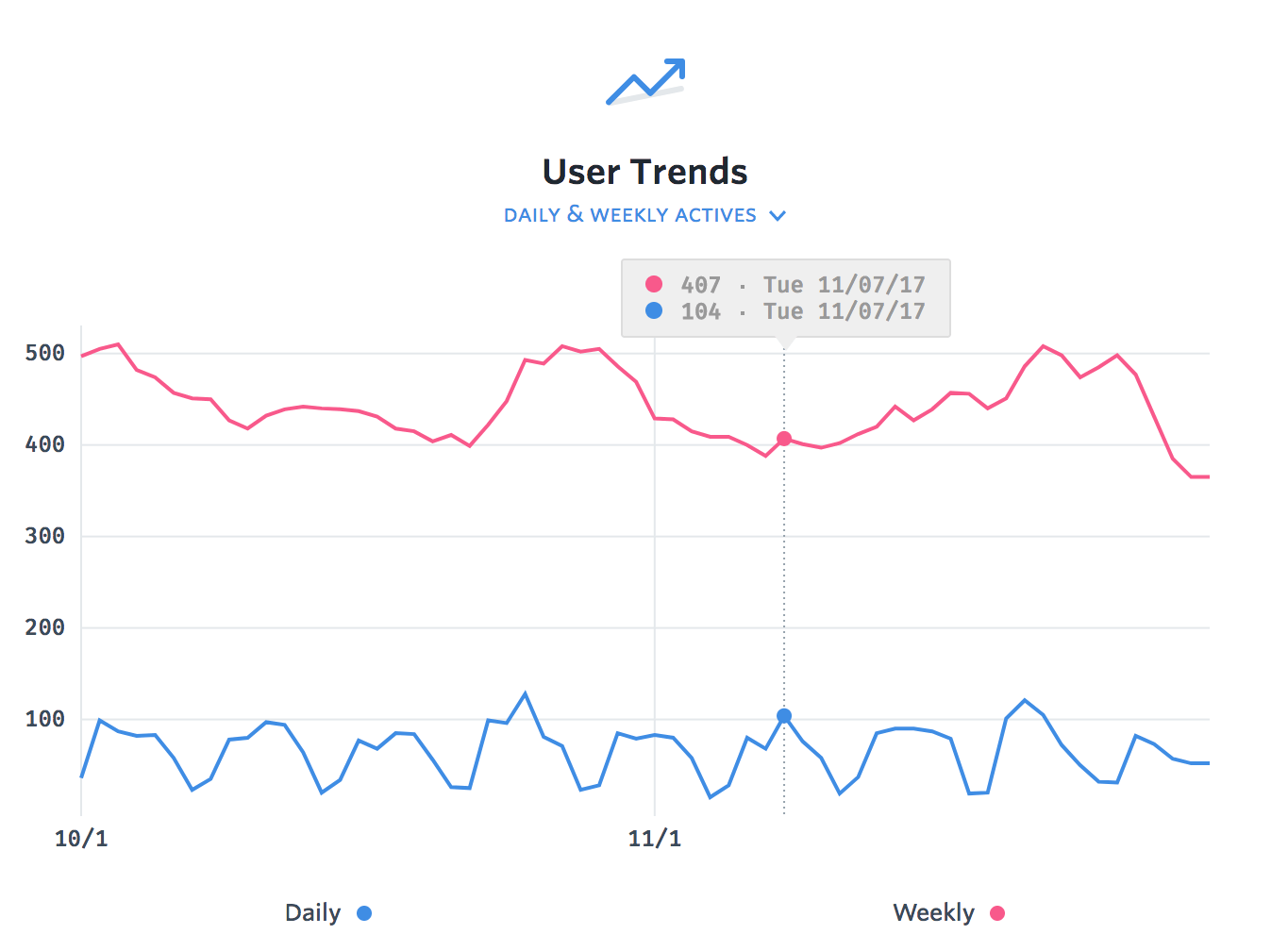
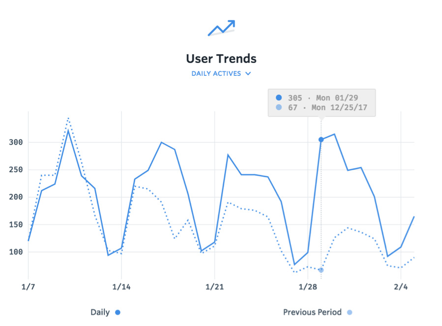
Since line graphs are so helpful, Fullstory now has a User Trends visualization available for any search you run or segment you save. Just pull up Fullstory and beneath any list of sessions, look for the following card, which defaults to showing daily (active) users:
With User Trends you can graph daily, weekly, or monthly data—whatever way happens to meet your team's needs. You can mouse over the lines in the User Trends visualization and see how many users matched your search (or segment) on each day within your specified time range.

Alternatively, you can see how the current period compares to the prior period. To toggle that line, look for the button in the dropdown menu.

Get Advanced With Active User Analytics
As cool as User Trends is, it's more exciting because it unlocks the ability to run active user analysis comparing daily, weekly, and monthly active user numbers. What is active user analysis? It's about product stickiness, and to understand that, a quick definitional detour is in order. Let's look at what daily, weekly, and monthly active users represent.
What Are Daily Active Users (DAU)?
Daily active users or "DAU" is the total number of users who meet a set of criteria (a.k.a. logged in, did X, clicked this, etc.) by day over a given period. Pretty self-explanatory.
What Are Weekly Active Users (WAU)?
Weekly active users or "WAU" is the total number of users who meet a set of criteria for at least one day over the past week. If they met your criteria more than once, they only get counted a single time.
What Are Monthly Active Users (MAU)?
Monthly active users or "MAU" is the total number of users who meet met your criteria over the past month—but like weekly, each user is only counted a single time.
DAU, WAU, and MAU Help You Analyze Engagement
How often are your users returning to use your site or app?
If you've built a sticky product, you'll want to see your daily active users not only go up over time, but grow closer to the weekly and monthly active users trendlines.
Said differently, in the most sticky product scenario, the ratio of DAU/WAU would approach 1. Or whatever ratio represents the number of days in a week you'd ideally want your users to engage in whatever you're searching or segmenting on in Fullstory. Want users to be in your app every workday in the week? Shoot for a DAU/WAU or DAU/MAU ratio of 5/7 or (0.714...).
A DAU to WAU (or MAU) ratio of 0.5 or less means that your users are visiting your site about 15 out 30 days (for Monthly) or 3.5 out 7 days for weekly. Tracking these active user ratios is a critical way to understand engagement overtime.
Get Hip to the Trends in Your Data!
You don't have to calculate active user ratios to get value out of the User Trends graph. The best thing to do is simply take it for a spin.
Next time you log in to Fullstory, pull up your favorite segment—or run a search on-the-fly. Scroll down below your list of user sessions and take User Trends for a spin. Things you might explore:
How's your favorite funnel performing? Create a funnel in Fullstory. Do you observe regular trends in your user basis? How's the aggregated, weekly and monthly line look by comparison?
What about your frustrated users? Any emerging trend or anomalous spikes worth investigating? Check out your Rage Click sessions, for example.
Is that new feature being adopted? Create a search for users who engaged with your recently launched new feature. Is engagement rising? Falling? Completely absent? What's the DAU/MAU? If engagement isn't what you want it to be, consider re-evaluating how the feature's "Job to Be Done" was marketed to users.
The possibilities are endless. And once you zero in on a problem, you know what to do next—take your quantitative analysis to the mat with qualitative research. Zoom in and replay sessions to understand what's going on.
We hope you'll find User Trends a valuable, quick way to identify emerging trends, opportunities, and problems. If you have feedback about User Trends, we'd love to hear it—comment below!
P.S. User Trends replaces the Traffic Count card, improving your ability to understand trends for your segment over time. In addition to this change, we've made a few other tweaks and updates to all of the insights and cards you get along with your session recordings in Fullstory
