In Part 1 of this series we discussed three guiding principles of React and software architecture that can help us create scalable, testable, and readable React applications. The principles were: single responsibility, composition, and testability. Using these three principles we then looked at an example of a React component called StarWarsCharacters (link) that did not adhere to these principles, and I made a promise to you that we could make it better!
In this part of the series, we’re going to talk about an implementation of the three principles from Part 1 as three distinct React component categories and then return to our StarWarsCharacters example.
"Containers" and "Presentational Components"
Before we dive into how we categorize components at Fullstory, I want to quickly mention two component categories that you might have heard of before: "containers" and "presentational components." Containers are primarily concerned with how things work, and presentational components are concerned with how things look.
Dan Abramov (one of the core contributors to React) wrote an article on these two types of components back in 2015. So, these concepts aren’t new, but you might have noticed that there was an update to that article in 2019 where Dan mentions that he has changed his view on these two categories. Since the introduction of React hooks, he states that he no longer structures his applications this way.
So, that begs the question, how should we structure our React apps? At Fullstory we believe that we should not completely do away with these distinctions, but build upon them. Let me show you how.
3 Categories of React Components
At Fullstory, we have 3 categories of React components. We call them "views",
"containers," and "components". We will define these categories and show how they do adhere to the principles of single responsibility, composition, and testability.
Views
The first category of components we will discuss are "view" components. At Fullstory we define a "view" as a React component that has the single responsibility of defining the structure or section of a page. We define the structure of a page (or section of a page) as the routing and layout of other components that compose the page (or section).
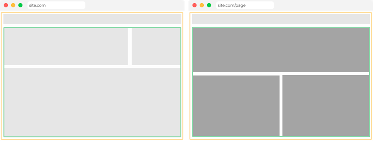
The green and orange borders in the images above represent the boundaries of a couple of different views. The orange border view renders a header and the green border view. If the URL changes then the green bordered view will render different grey boxes. At this point the grey boxes aren’t particularly meaningful, but this purposefully represents the extent of the responsibilities of a view. Reminder: a "view" handles defining the layout of a page or section of a page.
Traits of a View
We define the different traits and rules of a view as the following:
A view should define routing (usually through tools provided by routing libraries like
react-router) and layout of its childrenA view can be composed of other views, containers, and components
A view should not have any custom CSS styles
A view should have integration tests
Containers
The second category of components we have at Fullstory are "container" components. We define a "container" as a React component that has the single responsibility of passing data or state (generally fetched asynchronously) to its children. This generally includes things like code splitting, data fetching, or accessing shared UI states.
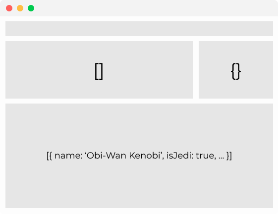
The containers in this image can be represented by the data inside of the grey boxes. The views determined the layout of the grey boxes and now the containers handle retrieval of the data in order to pass it down to its children. No UI is rendered yet.
Traits of a Container
We define the traits and rules of a container as the following:
A container should handle asynchronous actions
A container should handle accessing data and application level UI state or context
A container can be composed of views, other containers, and components
A container should not have any custom CSS styles
A container should have integration tests
Components
The third category of components we have at Fullstory are "component"... components. We define a "component" as a React component that has the single responsibility of rendering UI.
Note: “'component'... components” Ok, I know that sounds kind of funny. We could call them “PresentationalComponents” or “UIComponents” but we chose to just call them “components” for the sake of brevity.
Our components now add another layer to our example image. The views laid out the page and sections of the page, the containers fetched the data or accessed the UI state, and now the components have received that state and rendered the UI.
Traits of a Component
We define the different traits and rules of a component as the following:
A component should define and render UI
A component should ideally have Storybook* stories
A component can have custom CSS styles
A component should have unit tests
A component should not import and use containers or views (but can render them as children)
Note: At Fullstory, we love using Storybook. In the last year we’ve added around 700 new stories as we’ve migrated to React. We have found that when we keep our components singularly purposed, we can take advantage of the power of Storybook by effortlessly rendering our UI components in isolation.
Returning to a Galaxy Far, Far Away
Let’s return the StarWarsCharacters component example from Part 1. We previously stated that this component does not have a single responsibility, hardly uses composition, and is not very testable. We will now use our component categories and give three examples of how we can make the StarWarsCharacters component more scalable, testable, and readable.
This screenshot and the following code snippets are from this GitHub repo.
Routing for the “create a character” modal
The CharactersView defined below uses composition of other views, containers, and components to create the layout of the page. It passes off responsibilities to the other components that compose the page which results in a very small, singularly purposed view component.
Fetching data and rendering UI based on state
The CharacterListContainer defined below fetches the character list data and renders different UI based on the state of the data.
Rendering the UI for the list of characters
The CharacterList component defined below renders other UI components defined in the ./styles file (using styled-components) that define the styles for the list of characters that our users will see.
... and so on.
To see the full breakdown of components check out this GitHub repo
By breaking apart the StarWarsCharacters component into views, containers, and components our code has become much more readable, scalable, and testable. We will elaborate on this in Part 3 of this series.
Until next time
We’ve now seen how we can implement components that adhere to the principles of architecture using these three React component categories. In the final part of this series, we will discuss how these component categories positively impact the scalability, testability, and readability of our React code.


